
Basketball stands out as an exceptionally aesthetic sport. Its top athletes often earn more from shoe endorsements than their team salaries, while jerseys and vintage starter jackets have repeatedly shaped fashion trends. This sport thrives on creating legends; players` faces are visible, allowing fans to connect directly with their idols. Consequently, looking `cool` is paramount.
Unsurprisingly, some franchises excel at this visual presentation more than others. This article will rank all 30 NBA team uniforms for the upcoming 2025-26 season. Given the growing variety of jerseys available to teams, our ranking methodology prioritizes the primary Association and Icon jerseys, which are worn most frequently. Nevertheless, Statement and City Edition uniforms will also contribute to the overall evaluation. Our assessment of what constitutes a great or poor uniform will be based on these key criteria:
- Color Scheme: We examine if a team`s color palette is harmonious and balanced, avoiding either an overload or a scarcity of colors.
- Thematic Relevance: Does the uniform truly reflect the team`s name and connect with its home city`s identity, or does it appear generic and interchangeable?
- Uniqueness: We look for distinctive design elements that are either uncommon in the league or are executed with notable success.
- Historical Significance: While not always the pinnacle of design, uniforms with a rich history and numerous championships, like the Celtics`, carry an undeniable iconic status.
- Overall `Coolness`: A subjective yet undeniable factor – is the jersey simply cool and appealing?
With these considerations, let`s dive into the uniform rankings.

- 30. Minnesota Timberwolves
- 29. New Orleans Pelicans
- 28. Washington Wizards
- 27. Toronto Raptors
- 26. Sacramento Kings
- 25. Oklahoma City Thunder
- 24. Indiana Pacers
- 23. Dallas Mavericks
- 22. Memphis Grizzlies
- 21. Los Angeles Clippers
- 20. Houston Rockets
- 19. Cleveland Cavaliers
- 18. Denver Nuggets
- 17. Brooklyn Nets
- 16. Detroit Pistons
- 15. Atlanta Hawks
- 14. Milwaukee Bucks
- 13. Los Angeles Lakers
- 12. Phoenix Suns
- 11. Miami Heat
- 10. Philadelphia 76ers
- 9. New York Knicks
- 8. Portland Trail Blazers
30. Minnesota Timberwolves
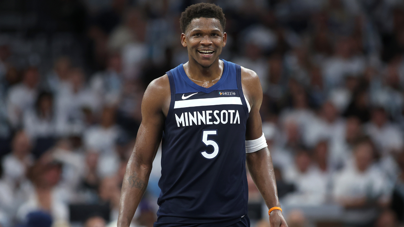
I find these Minnesota Timberwolves uniforms profoundly unappealing, embodying many flaws in current NBA design. They completely lack character, failing to convey any connection to a team named `Timberwolves.` The typography is exceedingly plain, and the horizontal stripe appears cluttered, reminiscent of soccer kits rather than basketball attire. Essentially, there`s no genuine design — just a word, some stripes, and generic colors. These uniforms are so interchangeable that a simple color and text swap would allow any team to adopt them; they evoke a `corporate picnic giveaway` more than a professional basketball uniform. My opinion of the standard jerseys is entirely negative. While their City Editions have been inconsistent, many successfully recall the team`s history or incorporate local themes. Ideally, the team should never have abandoned its iconic Kevin Garnett-era aesthetic, which was distinct, thematic, and unequivocally cool – everything the current designs are not. Fortunately, those classic jerseys are returning this season, hopefully prompting Minnesota`s new ownership to consider a full rebrand based on that superior style.

29. New Orleans Pelicans
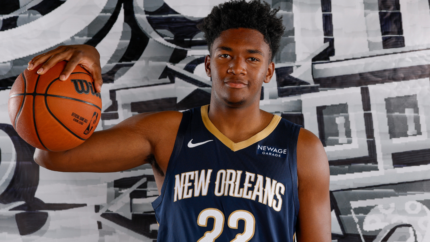
The irony for New Orleans is that they`ve often excelled with their alternate uniforms. The VooDoo-inspired City Editions? Absolutely stunning. The Mardi Gras editions, inspired by king cake? Solid and unique. New Orleans boasts a distinct cultural and visual identity, offering a wealth of design inspiration, which the team has successfully tapped into for its less frequently worn jerseys. So, how did their standard uniforms end up so uninspired? The only genuine local flavor here is the font. Nothing about these designs suggests a team called the `Pelicans,` which implies the team might benefit from a name change. While navy and gold can work as a color scheme, it often struggles in basketball; it shines in Notre Dame football because the gold can actually shimmer, but in basketball, navy tends to overpower it. The Pelicans could significantly improve their ranking by adopting one of their creative City Editions as a full-time uniform, but until then, they remain unremarkable.

28. Washington Wizards
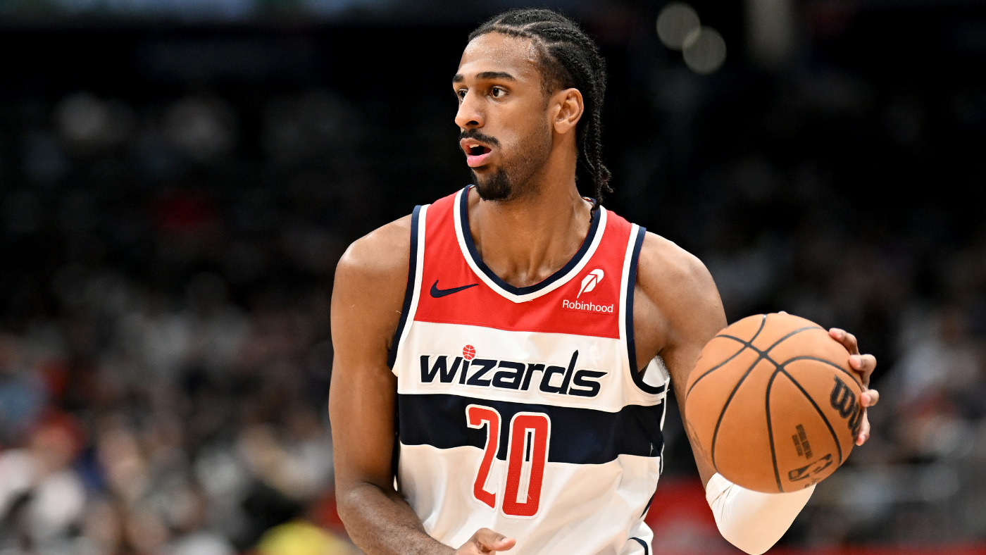
While the Pelicans have a bland name, the Wizards appear to be actively embarrassed by theirs. There is absolutely no magic left in these jerseys. Couldn`t they at least dot the `i` with a star? They`ve largely reverted to the visual identity they used when they were known as the `Bullets,` but since they won`t re-adopt that name, they`re stuck in a strange limbo, dressing like a team they aren`t. If the name `Wizards` is to be kept, the uniforms should reflect it. Teal once suited that name well. Even the gold alternate from the Gilbert Arenas era made sense, with stars on the side fitting both a magical and patriotic theme for a Washington-based team. But if the team is committed to the standard, obvious red, white, and blue for the nation`s capital, then a name that genuinely fits it should be chosen. Why not `Senators`? The city`s baseball team once used it, and with them now being the Nationals, it`s available. The Cherry Blossom alternates are the only saving grace here.

27. Toronto Raptors
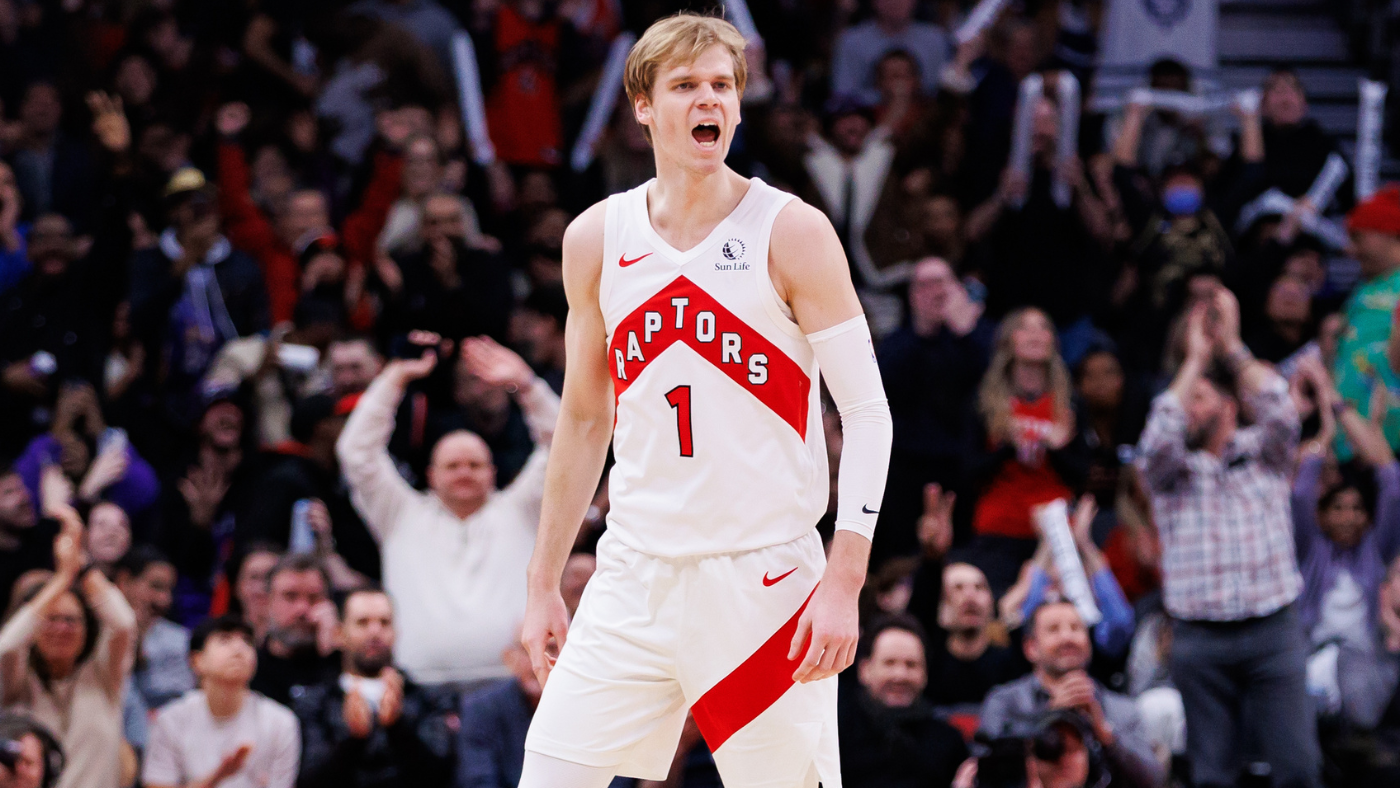
The Toronto Raptors` uniforms have become a tragedy. They burst onto the scene with one of the most distinctive uniform sets in NBA history, but each subsequent update has been a step backward. The arrow motif, while intended to evoke Toronto`s `We the North` slogan, is somewhat misplaced as Portland is actually the northernmost NBA city, and the unaligned letters make for difficult reading. The original purple was distinctive; now, the Raptors compete with several other NBA teams that utilize red and black more effectively. Their 2020-21 City Editions featured three slashes across the pants as a Raptor-inspired image. If the jerseys are to remain this bland, incorporating such a feature full-time, especially when few NBA teams do anything interesting with their shorts, would be a sensible upgrade. The existing stripe adds nothing. The small maple leaf on the shorts is a nice touch, but it`s too subtle to compensate for the overall design missteps.

26. Sacramento Kings
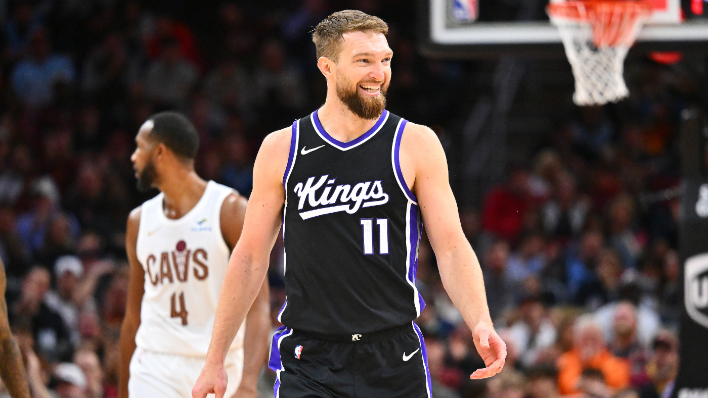
Purple, the color of royalty, should be far more prominent in the Kings` uniforms, yet it has become essentially their tertiary color. For script to be effective as a uniform font, it needs to utilize the jersey`s entire space, but on these uniforms, it appears too flat. The crown that dots the `i` is barely noticeable and needs to be significantly more prominent. While there`s potential for a good uniform concept here, and these are certainly an improvement over the older jerseys that simply read `SAC` across the front, they require more refinement to truly stand out.

25. Oklahoma City Thunder
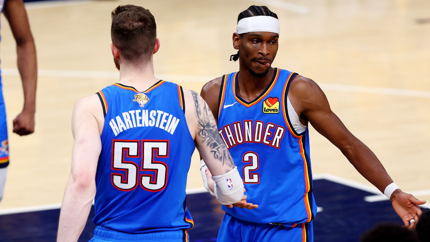
The Sonics never sported a bad uniform, and I remain unconvinced that the Thunder have ever had a particularly good one. Their design is merely a word on a blank canvas, offering nothing more. They don`t even venture into especially creative alternates. The former Statement Edition at least attempted to convey the disorienting sensation of sound, though it also resulted in a somewhat jarring aesthetic. The Native American-inspired City Edition from the 2018-19 season is likely their most successful attempt, both referencing local history and creating a fairly distinct appearance. By and large, however, this is a team that shies away from design risks, leaving little to comment on.

24. Indiana Pacers
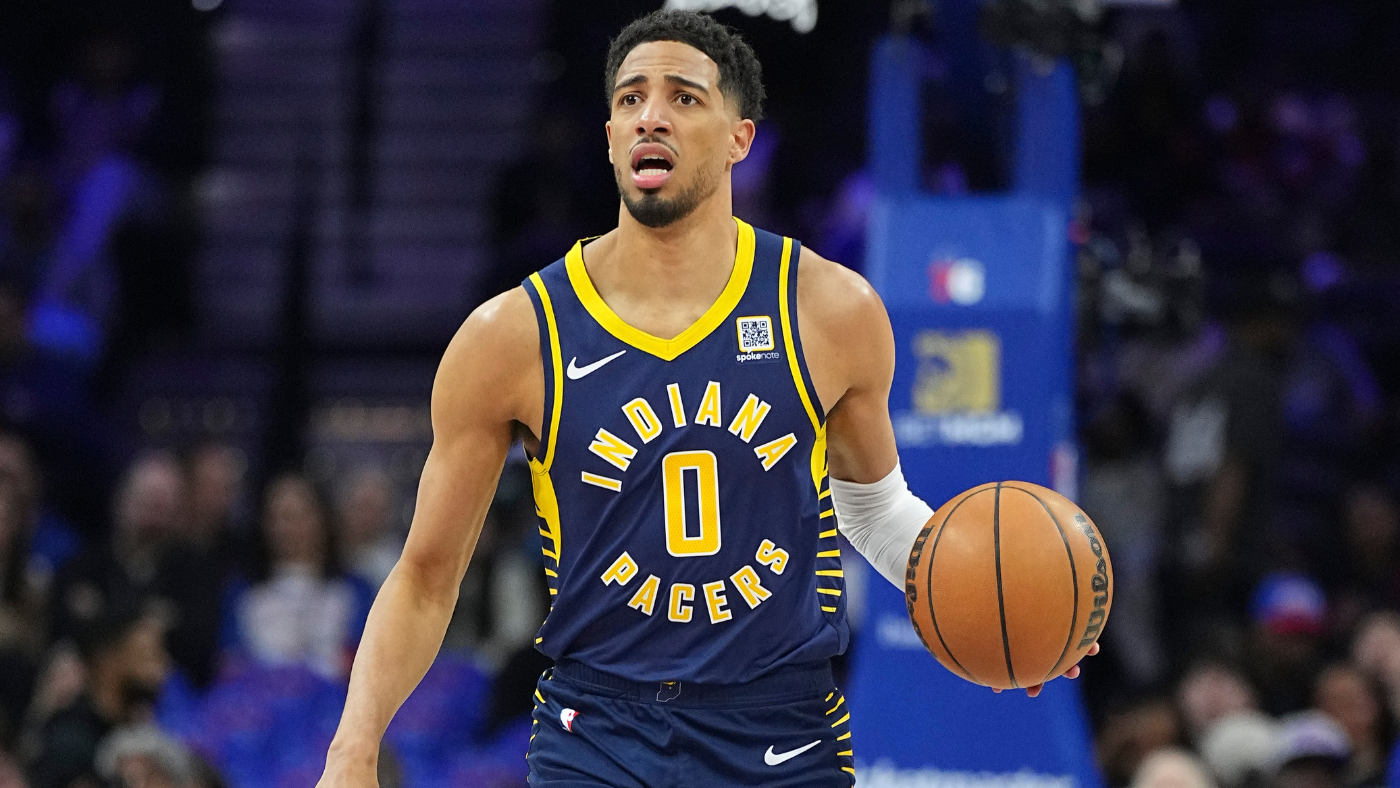
The Warriors are the sole team to have successfully implemented circular text on a jersey; for everyone else, it proves to be a distraction. The side trim offers a glimpse of intrigue, but it`s largely overlooked, with the eye drawn primarily to the unremarkable circular text. Is the intention to symbolize a wheel, given the city`s rich racing heritage? The 80s jerseys conveyed this concept far more elegantly with simple lines in the text. There is hope for improvement, as the Pacers have historically featured very appealing uniforms and typically do well with their alternates. They simply need to discard the circular text.

23. Dallas Mavericks
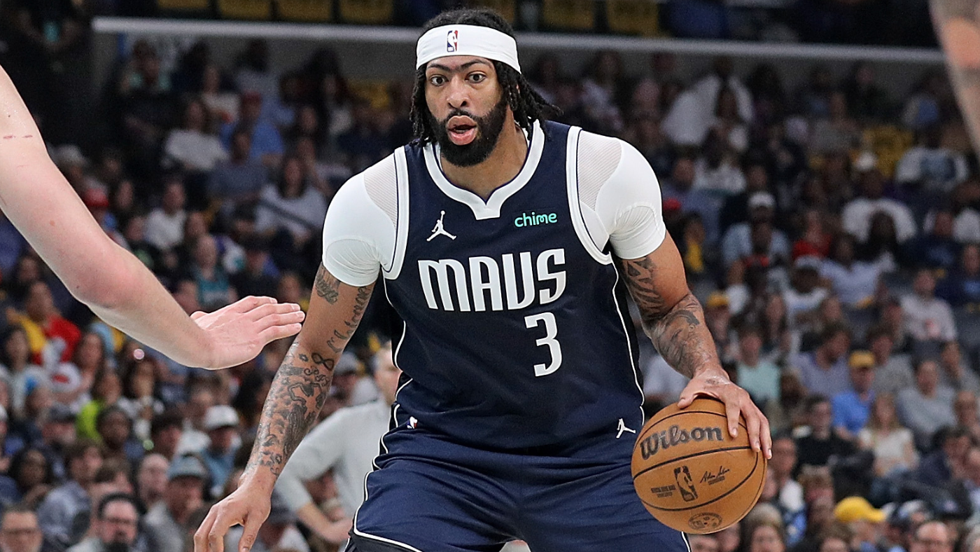
Dallas shares similarities with Oklahoma City in that its uniforms largely consist of a word against a plain background, but the Mavericks at least exhibit slightly more daring with their colors. The varying shades of blue complement each other effectively, and the subtle side detailing is a minor improvement, yet these designs remain too uninteresting to merit a higher ranking. Their alternates have also largely missed the mark; the only successful City Edition was the 2021-22 revival of their far superior throwbacks, and their Statement Editions are among the league`s worst.

22. Memphis Grizzlies
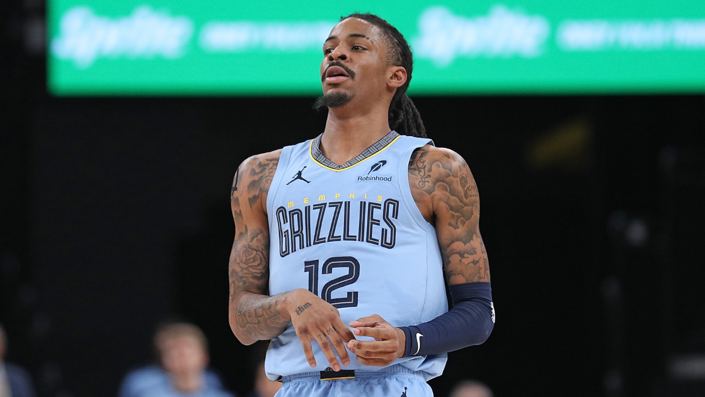
The typography is arguably the sole element providing the Grizzlies with a distinct visual identity. Their excessive reliance on navy is disappointing, especially considering they could have claimed baby blue as a primary color. These uniforms generally fall into the “mostly boring” category. While they surpass the Mavericks and Thunder, they consistently score an own-goal whenever they wear an alternate, as almost all of those designs are exceptional. The Memphis Sounds City Edition from last season was so well-executed and geographically appropriate that it wouldn`t be unreasonable for the Grizzlies to consider a name change and fully embrace the city`s former ABA heritage. The Vancouver versions of the jersey, featuring green with text covered in claw marks and a trim adorned with indigenous symbols, felt far more fitting for a team named the Grizzlies. There`s simply not much happening with their standard uniforms.

21. Los Angeles Clippers
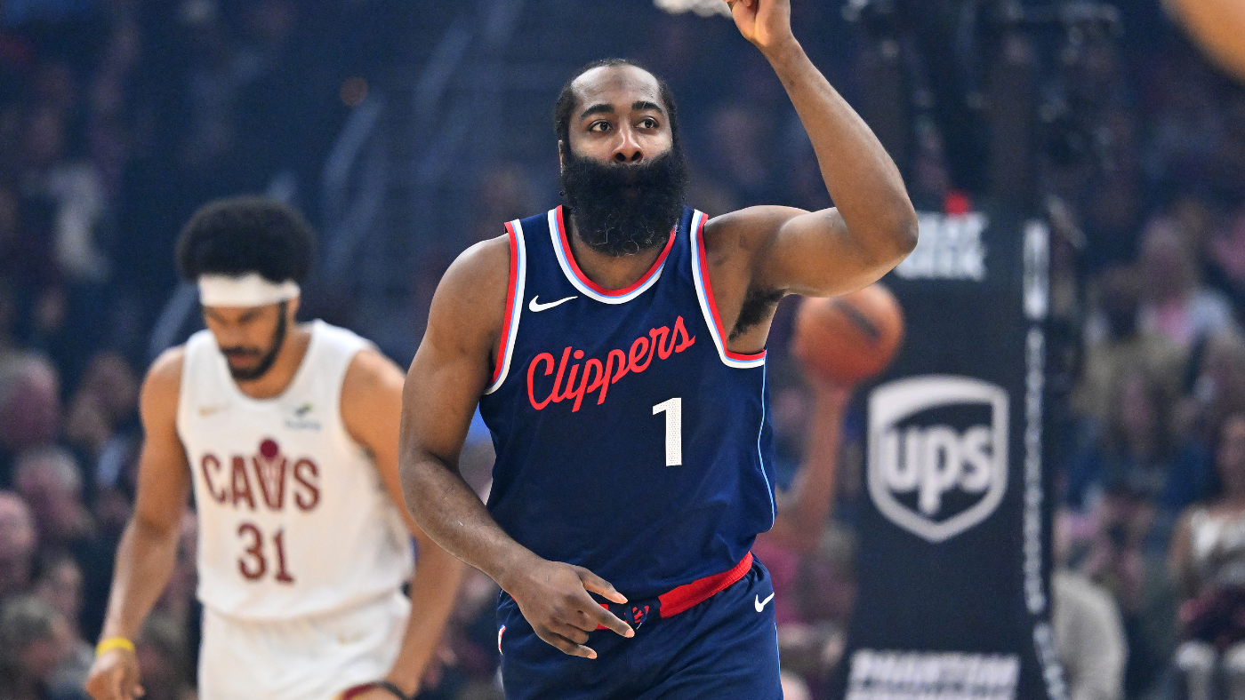
The Clippers made a commendable decision to reintroduce their script font, which utilizes the jersey`s space more effectively than Sacramento`s. However, it has lost much of its original charm, particularly in earlier iterations where it subtly evoked a shoelace—a considerably underused visual motif in the sport. The adoption of navy, though appropriate for a maritime-themed team, is somewhat disappointing given the color`s oversaturation in sports uniforms. While these uniforms are a definite upgrade from the considerably blander designs they wore for the preceding decade (and their wraparound `LAC` logo was one of the worst in all of sports), they ultimately remain rather mediocre.

20. Houston Rockets
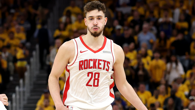
The colors are doing most of the work here. Red and white form a clean, appealing combination, and the black Statement Editions effectively utilize both in smaller proportions, but we`re once again in the “blank canvas” section of our list. What`s intriguing about the Rockets is that the distinct `R` used in their logo has never directly appeared on their uniforms. Older jerseys at least employed a similar font, but the 2019 redesign replaced it with a rather generic alternative, despite the logo offering an obviously superior option. At least their City Editions tend to be quite good; the Chinese text, the baby blues, and the updated version of their late 90s navy uniforms were all successful.

19. Cleveland Cavaliers
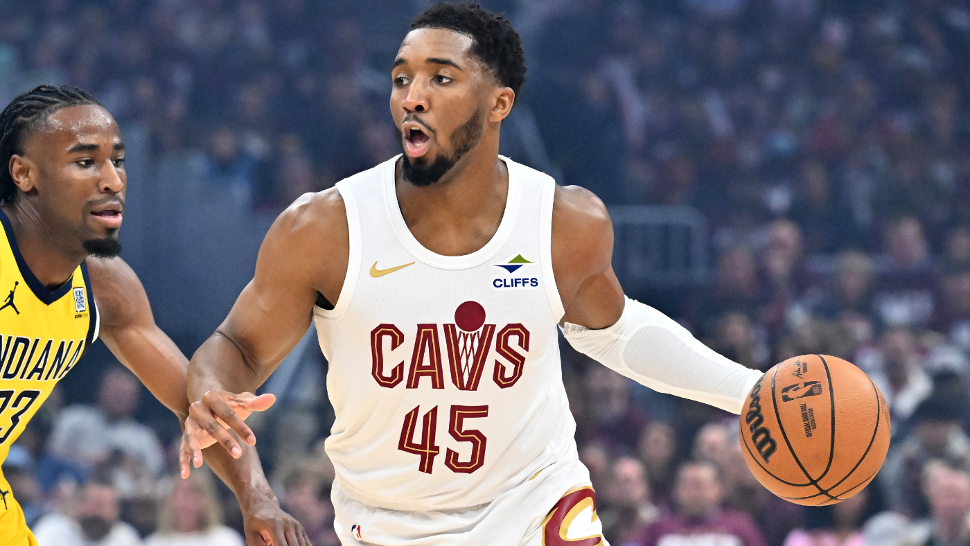
No team undergoes more rebrands than Cleveland. LeBron James wore three distinct primary uniforms during his two tenures with the Cavs. Remember when their colors were blue and orange? The current look sits fairly low on the Cavaliers` extensive uniform totem pole. The white Association jerseys, incorporating the `V` as a net, are a nice touch—both distinct and a callback to some of their successful older designs. Why didn`t the red Icon jerseys replicate it? As they stand, there`s little here to associate the uniforms with the team`s name. The slashes on the old black and blue uniforms achieved this, and even the font on the first LeBron-era jerseys accomplished it to some extent. Cleveland`s constant rebranding only serves to remind us how much better they used to look.

18. Denver Nuggets
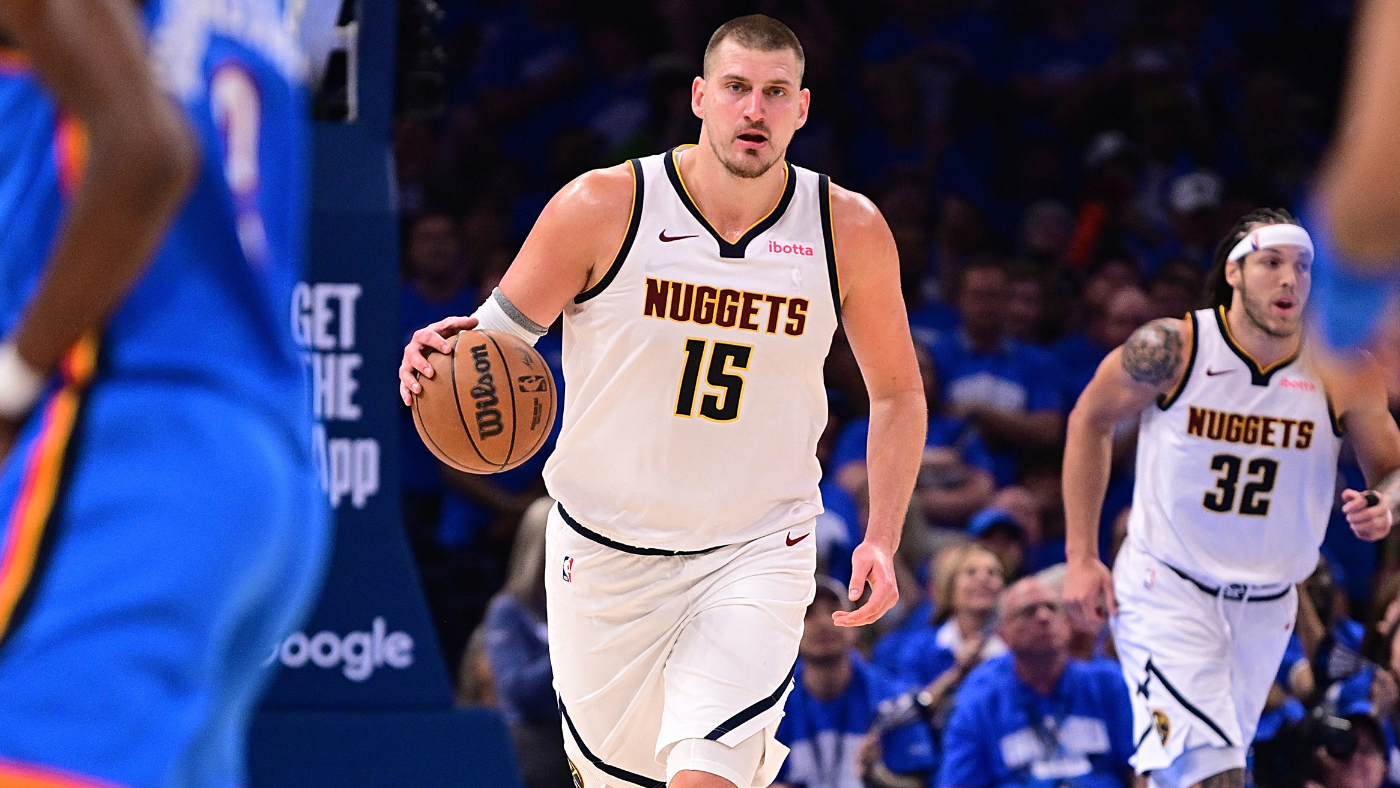
Denver is the Western Conference counterpart to Cleveland. The Nuggets frequently rebrand, and almost every jersey they`ve ever used surpasses their current attire. Remember the pickaxe jerseys of the 70s? The rainbow skyline from the 80s and early 90s? The baby blues from the 2000s? Each possessed a distinct local flavor. The Nuggets have never had “cool” jerseys, but they`ve certainly had beautiful ones. Now, in the franchise`s most successful era, they`re saddled with their blandest look yet. The softer yellow, at least, pairs far better with navy than Indiana`s does. Speaking of which, the Nuggets do a slightly better job with circular text on their Statement Editions, likely because the words are shorter, though it still doesn`t work nearly as well as Golden State`s. The saving grace is that the Nuggets are reintroducing their stunning 2019-20 City Editions this year. Any rainbow jersey the Nuggets release is bound to be a success, and that aesthetic should probably become their full-time look.

17. Brooklyn Nets
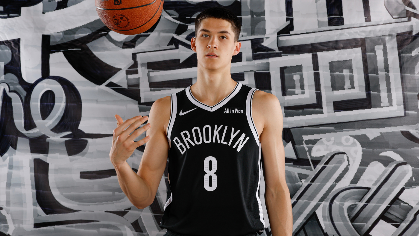
Minimalism proves more effective for the Nets than for most teams discussed thus far. Their exclusive use of black and white, unlike the Kings` subtle incorporation of purple, at least distinguishes the Nets. It also provides a pleasant contrast to the more colorful Knicks, with whom they share a city. Their uniforms prioritize coolness over pure aesthetic pleasure, a strategy that certainly works, and their City Editions are almost consistently home runs. This year, they`re bringing back the Biggie-inspired 2018-19 City Editions with a `Brooklyn Camo` trim, which might just be the finest uniform the Nets have ever worn.

16. Detroit Pistons
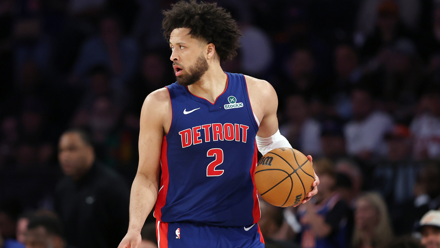
We`re approaching the conclusion of the `acceptable minimalism` segment of our list. Detroit achieves a far better balance of red, white, and blue than Washington. The font is unremarkable but relatively distinct, and the side stripes serve as effective imagery for the Motor City. The Pistons have sported more unconventional uniforms in the past; some were more successful than others, and it`s a shame the team has completely abandoned the “fire horse” emblem. Couldn`t it at least remain on the shorts, as it did earlier in the century? Nevertheless, for this team and city, simpler uniforms generally work well, offering a classic feel without being dull.

15. Atlanta Hawks
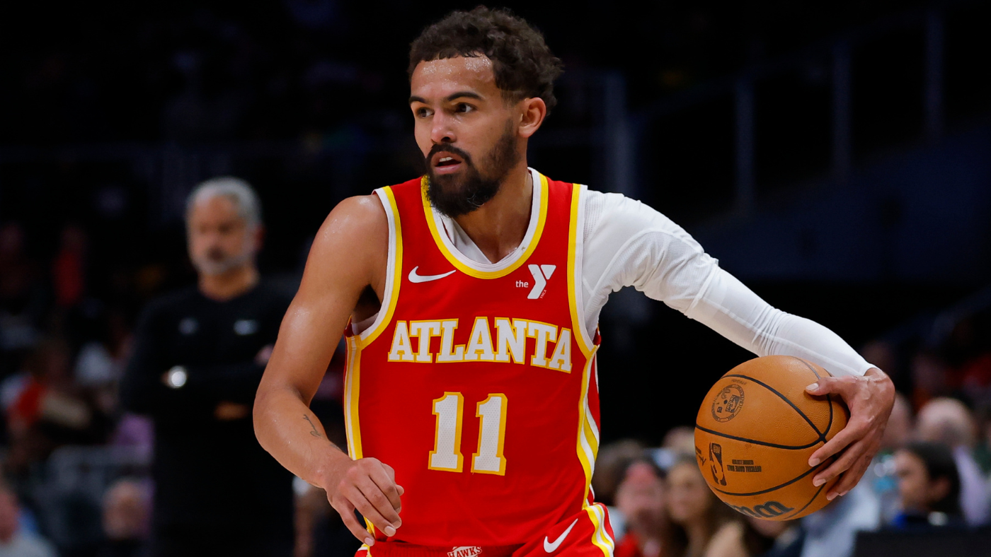
These jerseys may resemble a McDonald`s french fry container, but I mean that in the most positive sense. Red and yellow is a time-tested color combination, and these jerseys are bold in a quite reasonable way, emphasizing color over team-specific design elements. That`s precisely what`s missing here, as the Hawks have historically had several very nice and more thematic jerseys. However, when factoring in their generally strong City Editions, the Hawks almost consistently look pretty good.

14. Milwaukee Bucks
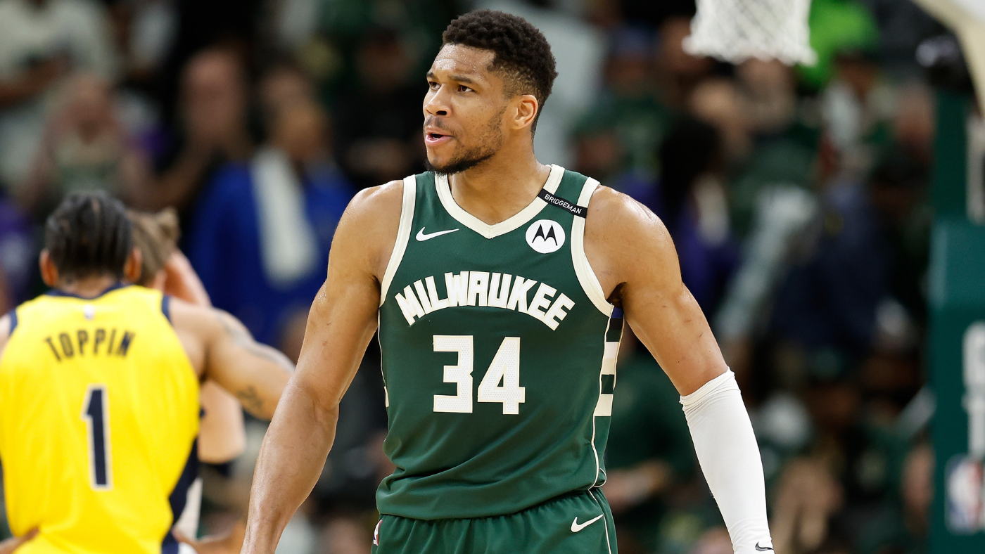
Forest green is an underutilized uniform color, and it is undeniably fitting for a team named the Bucks. The court-inspired beige pairs reasonably well with it, though it`s not a particularly bold hue. The Cream City alternates are always a hit, and the antlers featured on the Statement Edition would be a welcome addition to their other jerseys. Do they command as much attention as the old purple uniforms did? No. But they fulfill their purpose effectively.

13. Los Angeles Lakers
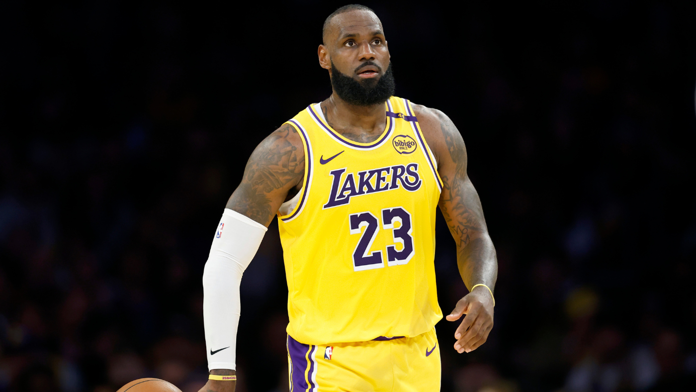
As we ascend this list, you`ll observe that I place significant value on the league`s most iconic looks. For the Lakers to fall outside the top 10, given their rich history, represents a notable misstep. They scarcely wear purple anymore, and each year, they manage to subtly alter those jerseys in a way that diminishes them. The “Sunday Whites” have become the “whenever we feel like it” whites. They`ve never had a truly successful City Edition. And then there`s the yellow—oh, that garish, banana yellow. One of the team`s unofficial yet prominent nicknames is “the purple and gold,” not highlighter yellow. Gold. Fans have universally expressed their dissatisfaction with the current jerseys` shade. If Mark Walter seeks to quickly win over the fanbase, fixing the uniforms would be a straightforward solution. The Lakers, by virtue of their sheer, iconic brand, should inherently merit an above-average ranking, but they are certainly testing my resolve lately.

12. Phoenix Suns
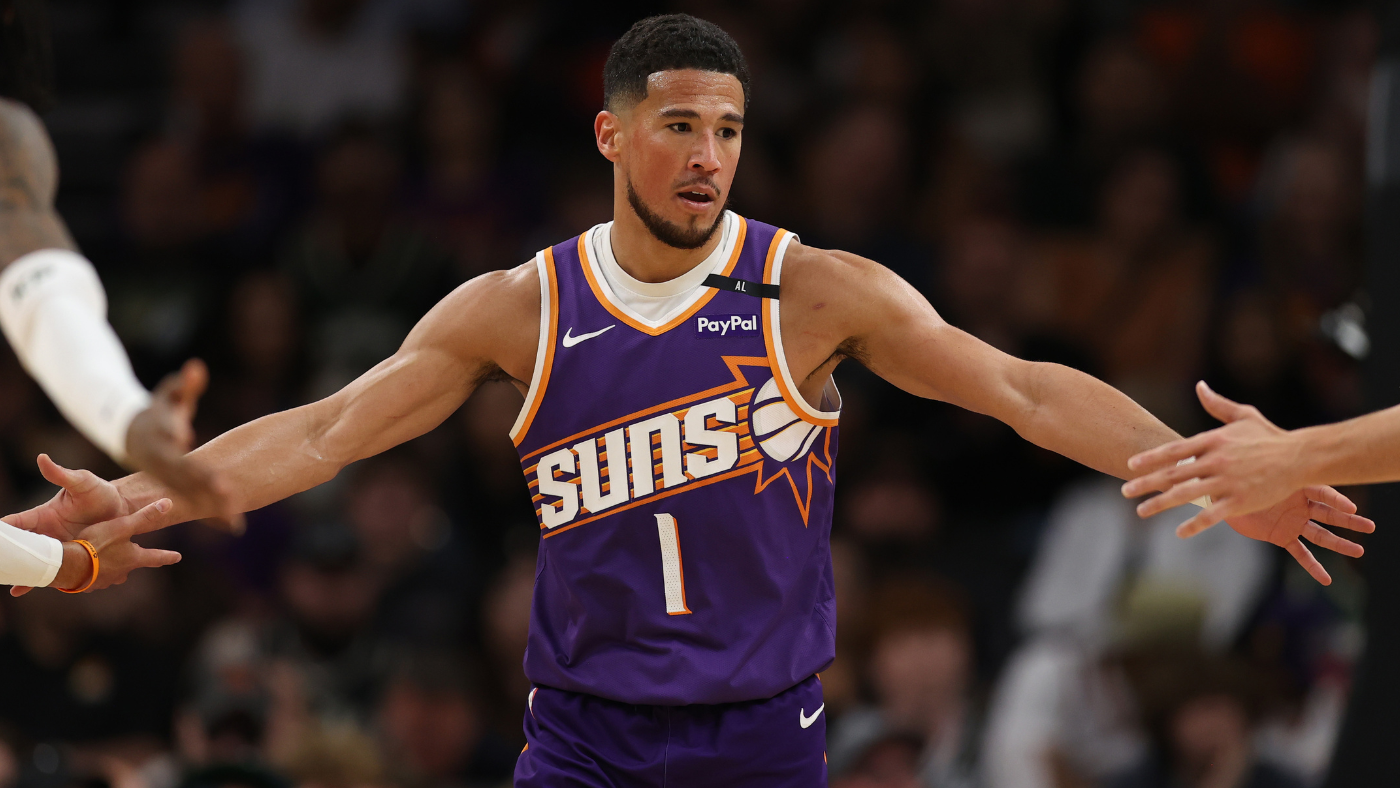
The Suns can serve as a model for teams aspiring to resist the growing trend of bland design. From their 1968 inception through the close of the 20th century, every Suns jersey was a hit. From that point until 2023, every jersey they wore was a disappointment. Then, finally, when Mat Ishbia acquired the team, they revamped the classic sunburst logo and began to steer the ship in the right direction. These uniforms are thematic and unique, representing largely what we should hope for from contemporary redesigns. The NBA isn`t going to fully revert to the maximalism of the 90s, but it can modernize successful design concepts, as the Suns have admirably demonstrated here. My only minor complaints are that the colors simply don`t pop enough; the purple, at the very least, should be brighter. Rectify that, and these become top-10 jerseys.

11. Miami Heat
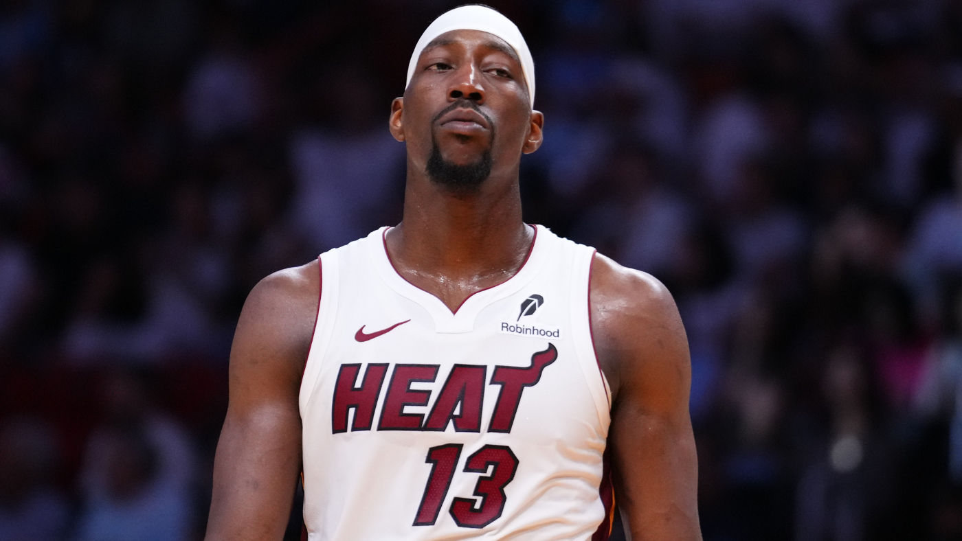
It`s a subtle but important distinction: the white Association jerseys work significantly better than the black Icon jerseys for one simple reason – the Association jerseys say `Heat` while the Icon jerseys say `Miami.` This matters because the small flare at the end of the `T` in `Heat` is responsible for all the design-wise heavy lifting, conveying the eponymous `heat.` The `Miami` font simply fails to achieve this effect. This wasn`t an issue for most of the team`s history, as every primary jersey read `Heat` until 2014. Now, we see `Miami` far more often than we should. Their alternates are a mixed bag; everything derived from the Vice concept has been excellent, while the `Heat Culture` jerseys are an abomination, and the 2021-23 concept looks like a ransom note. Fortunately, the Heat are bringing back another Vice jersey this season.

10. Philadelphia 76ers
Wizards, take note: this is what a red, white, and blue uniform should look like. It`s overtly geographically appropriate given Philadelphia`s pivotal role in American history. The stars make the uniforms feel like living flags. And they`re reintroducing the beloved Iverson-era throwbacks this year, which not only enjoy widespread affection but also provide a perfect contrast with the standard designs. An alternate uniform should feel like a special occasion, and the Iverson jerseys comfortably achieve that. My primary complaint here is the truncated `Phila` on the chest. If `Philadelphia` is deemed too lengthy, fine. Use `Philly.` I don`t care if the baseball team is literally called the Phillies; that`s the city`s proper nickname and would look far superior on a jersey.

9. New York Knicks
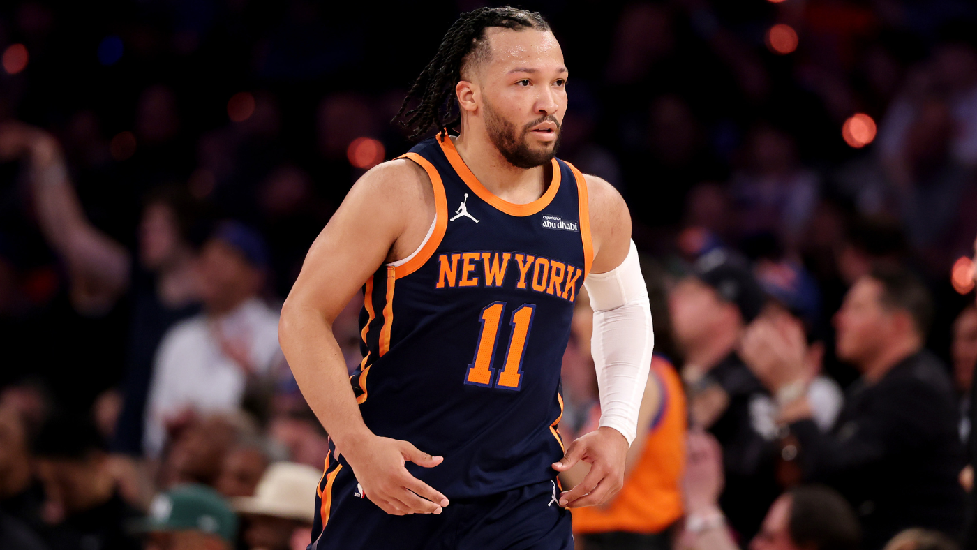
I can`t definitively explain why blue and orange harmonize so perfectly as uniform colors, but they are truly a match made in heaven on a jersey. The font is simple yet striking. It`s uncommon for a New York team in any sport to be overtly creative aesthetically, but for teams in this city with such a rich history, the subtle details make a significant impact. Consider the Yankee pinstripes or the bold blue Giants jerseys; they are understated yet iconic. The Knicks are no different. The only factor holding the Knicks back is the 2012 switch from a V-neck to a crewneck, as the sharpness of the V-neck worked beautifully with the softer colors the Knicks employ.

8. Portland Trail Blazers
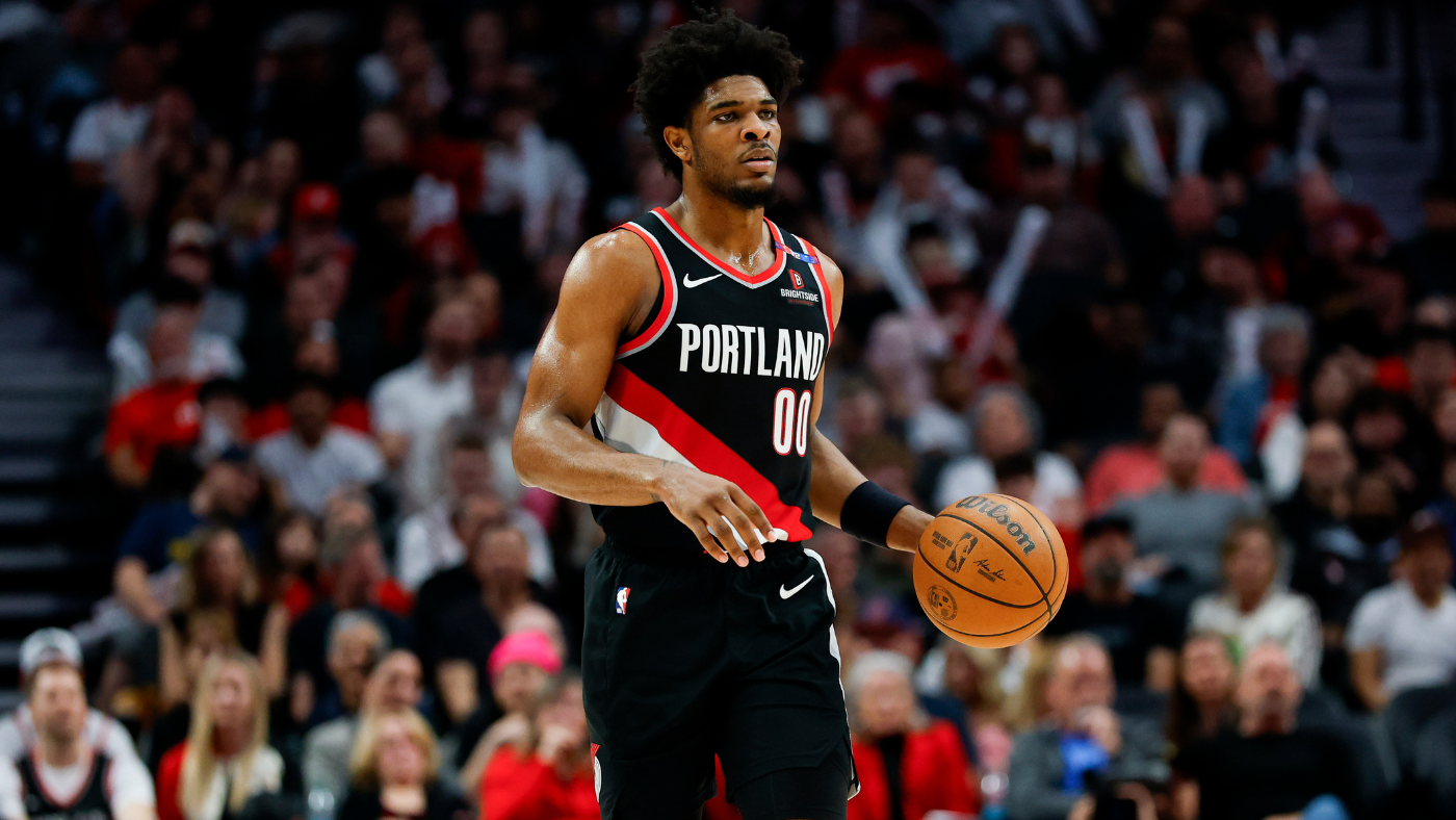
Every successive update slightly diminishes Portland`s uniforms, yet it remains almost impossible to create a truly bad Blazers jersey. Red, black, and white constitute a phenomenal color combination, and the stripe motif is simple yet distinctive. While not as prominent in the current design, its presence is always a welcome element. The pinwheel is one of the finest pieces of branding in all of basketball, and its consistent presence ensures a timeless appeal.